#
Checkboxes and Radio
Get rid of native look n' feel with our very own custom checkboxes written purely in CSS. These are retina compatible and available in all Bootstrap's contextual classes (ex: .primary)
#
Checkbox
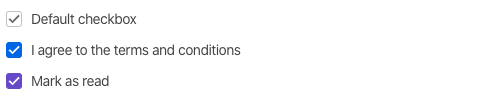
const [checkBox, setCheckBox] = useState(true);

<div className="form-check primary">
  <Input
    type="checkbox"
    id="checkbox1"
    onClick={() => setCheckBox((prevState) => !prevState)}
    checked={checkBox}
    onChange={() => {}}
  />
  <Label htmlFor="checkbox1">Mark as read</Label>
</div>;
#
Shape options
Bored with traditional boxed shape check boxes? Here is a circle one simply add the class .checkbox-circle to change it

const [shapeAlternativeTwo, setShapeAlternativeTwo] = useState(true);

<div className="form-check primary">
  <div className="form-check checkbox-circle danger">
    <Input type="checkbox" id="checkcircleColorOpt1" />
    <Label htmlFor="checkcircleColorOpt1">Delete all personal settings</Label>
  </div>
  <div className="form-check checkbox-circle complete">
    <Input
      type="checkbox"
      id="checkcircleColorOpt2"
      onClick={() => setShapeAlternativeTwo((prevState) => !prevState)}
      checked={shapeAlternativeTwo}
      onChange={() => {}}
    />
    <Label htmlFor="checkcircleColorOpt2">Keep me signed in</Label>
  </div>
</div>;
#
State options
These act the same way as normal HTML check boxes. Here are some states that

const [statesIntermediate, setStatesIntermediate] = useState(true);

<div>
  <div className="form-check form-check-inline complete">
    <Input
      type="checkbox"
      id="checkboxIndeterminate"
      onClick={() => setStatesIntermediate()}
      onChange={() => {}}
    />
    <Label htmlFor="checkboxIndeterminate">Indeterminate</Label>
  </div>
  <div className="form-check form-check-inline">
    <Input
      type="checkbox"
      id="disableCheck"
      onChange={() => {}}
      checked
      disabled
    />
    <Label htmlFor="disableCheck">Disabled checkbox</Label>
  </div>
</div>;