#
Progress & Activity
#
Linear Progress
#
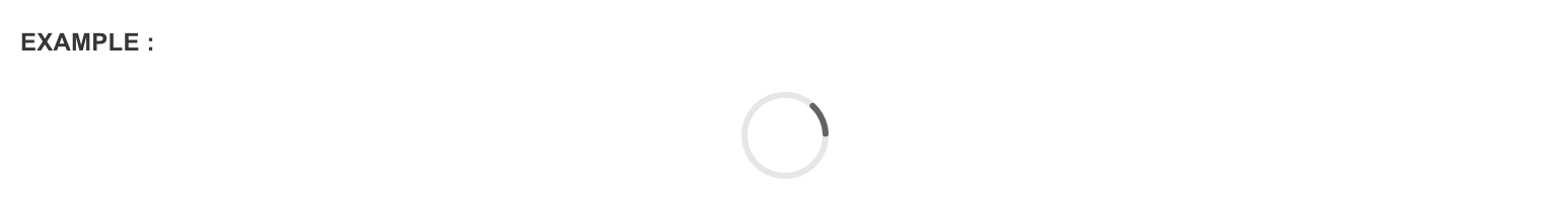
Indeterminate progress
Indicates a running process where the progress is unknown using an animated svg. ex: AJAX form submission. Simply wrap .progress-bar-indeterminate with Bootstrap's .progress. The progress bar will automatically expand to get the width of its parent <div>
<div style="width:50%">
    <div className="progress">
        <div className="progress-bar-indeterminate"></div>
    </div>
</div>
#
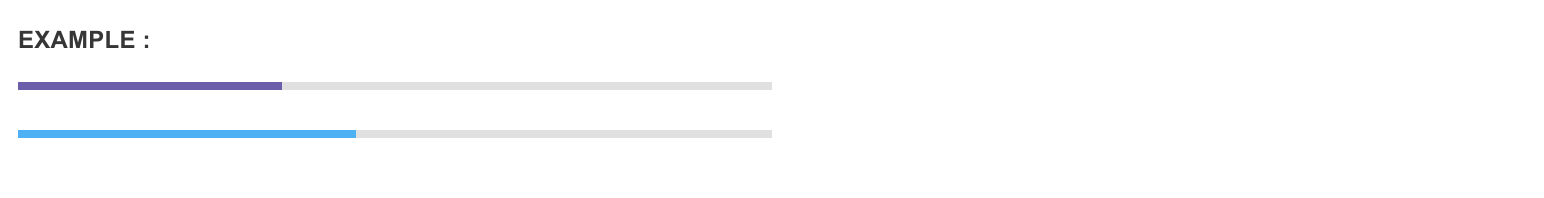
Color options
In addition to Bootstrap's contextual progress bar classes, Pages has introduced two new classes, .progress-bar-successand .progress-bar-complete if you want to add more color to your project
<div style="width:50%">
    <div className="progress">
        <div className="progress-bar progress-bar-primary" style="width: 35%;"></div>
    </div>
    <div className="progress">
        <div className="progress-bar progress-bar-complete" style="width: 45%;"></div>
    </div>
</div>
#
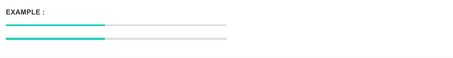
Size Options
Append .progress-small to .progress to make the progress bars thinner than the usual height
<div style="width:50%">
    <!-- Thinner progress bar -->
    <div className="progress progress-small">
        <div style="width: 45%;" className="progress-bar progress-bar-success"></div>
    </div>
    <!-- Default height -->
    <div className="progress">
        <div style="width: 45%;" className="progress-bar progress-bar-success"></div>
    </div>
</div>
#
Circular Progress
Don't like the linear style? Try circular progress indicators instead. These also come with determinate and inderminate options
#
Indeterminate progress
<div className="progress-circle-indeterminate"></div>
#
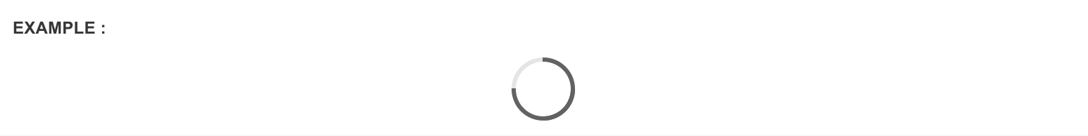
Determinate progress
A determinate circular progress indicator can be initialized without writing a single line of Javascript code by simply including markup below. Pass any percentage value (0-100) into the value field to set the progress
<!-- Show 75% of progress -->
<input
    className="progress-circle"
    data-pages-progress="circle"
    value="75"
    type="hidden"
    data-color="complete"
/>
#
Color options
Color options can be set using the data-color attribute. Any contextual color can be included.
<input
    className="progress-circle"
    data-pages-progress="circle"
    value="45"
    type="hidden"
    data-color="complete"
/>
<input
    className="progress-circle"
    data-pages-progress="circle"
    value="65"
    type="hidden"
    data-color="primary"
/>
<input
    className="progress-circle"
    data-pages-progress="circle"
    value="75"
    type="hidden"
    data-color="success"
/>
#
Size options
Stroke of the circle can be made thicker by setting data-thick="true"
<input
    className="progress-circle"
    data-pages-progress="circle"
    value="75"
    type="hidden"
    data-thick="true"
/>